This might help you…….
What’s involved in the marking process?
Before you decide on your personalisation choice it might help if we explained a bit about the process of marking the bands once we have your order.
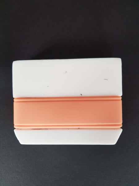
Let’s have a look at the marking process. We put your band onto a process jig and stretch it slightly initially, to avoid any potential distortion in the finished product, and also to ensure that the band doesn’t move around while it’s being marked.
So your band is now ready for marking! To do this, we use laser technology.
The laser is actually CO2 wavelength based and we use Galvanometer controlled mirrors in the process, these guide the laser to the right position to mark your band. In layman’s terms we use a beam of light which is focussed down to a very small spot, which then heats up the surface of the silicone to engrave your band.
The advantages of using CO2 are great - it has a large spot size which allows us to burn away silicone fast, keeping the cost to a minimum; it also has another advantage - silicone, our material, works really well with CO2 because it absorbs the energy much better than other light wavelengths.
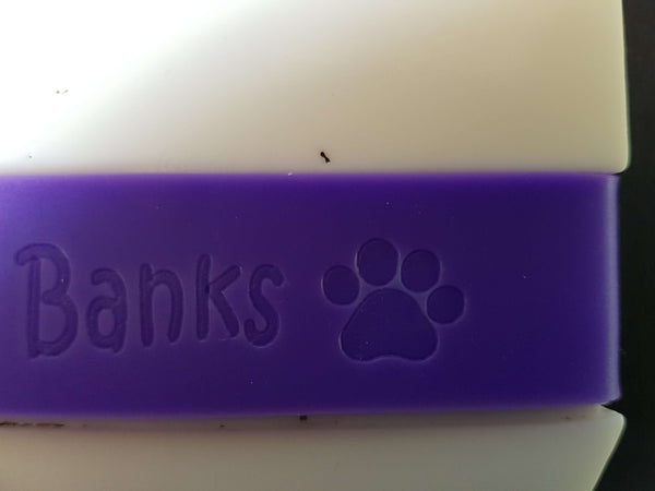
We don’t change the colour of the surface to mark your band, but we achieve an effective engraving by having surfaces that contrast with each other. The original band surface is slightly matt and the laser marking produces a smooth, shiny surface, so we successfully mark your band by contrasting the smooth lettering with the more matt band.
We use a computer and software suite to aid us in marking your band with the chosen personalisation. This ensures that we get your band marked correctly and in the right place, just as you want it to look!
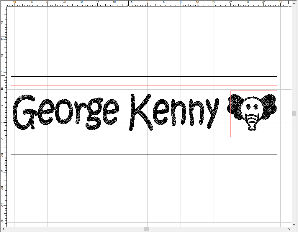
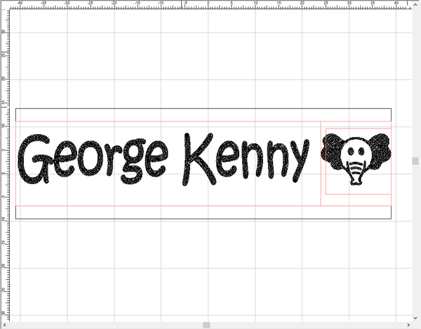
In the third photo you can see the band and the various areas that are allocated so that we can mark your band as you have chosen. The red outer box is the overall band area when it is stretched over the Jig (88mm x 24mm). The orange box to the left side is the area set aside for the text detail, the box to the right is for the positioning of the icon you have decided upon.
The advantage of this method is that the computer operator can check that everything is in the right place before the band is marked, so it will come out as you ordered it, looking good.
Sounds fairly straightforward so far? Well, getting your band looking good can be a little more complicated….that’s where we must consider how best to optimise your personalisation.
Personalisation selection….some hints…..
To start off with, you might have noticed that the lettering on our bands doesn’t go all the way around. We mark your band with your chosen personalisation in one area, which looks aesthetically pleasing when the band is on the bottle. If we were to mark your band all the way around it would mean different machinery and a much more expensive product!
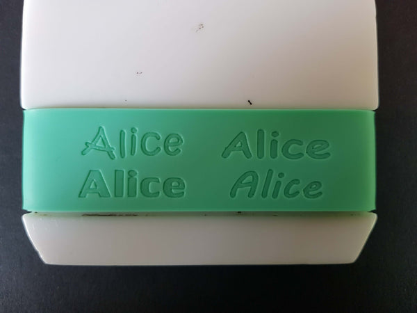
When you order with us we advise you that you can choose personalisation up to 20 characters per line. In practice though, the more letters you choose, the greater the reduction in size we have to make to fit them in. The amount of reduction depends also on the font you choose. When restricting the length we have to reduce each character by a % to meet the overall dimensions we have set. There is also a reduction in thickness of line of the characters - in sum, both these factors can affect the look of the end result.
If you take a look at the image four you’ll see a couple of examples that illustrate what we mean. In the first image the characters are unrestricted but in the second image the character string is restricted in length. The height and width of the characters remain unchanged but the look of the lettering can be severely affected.
We always attempt to optimise your personalisation in the best way that we can to give you the best possible result.
We think that the best solution, if you have chosen a lot of characters, is to split the name onto two lines. This would mean that while the height would be restricted, the width and line length would be unchanged, which looks aesthetically better than reducing line length. Have a look at photo four for a good example of this.
Font choice and name length
What if you don’t want your personalisation on two lines? Then look carefully at which font you choose! Aim for the font with the lightest possible line. Sloping off, for example, gives you a light font with short character and line width. This means that even if we have to restrict the line length, the effect on the overall look of the lettering is minimal.
The other photos show the same name restricted in length, the bottom image is an example of the name being split onto two lines with no restriction on the way the words are laid out - better in our opinion!
What about short names? Well, in this case you won’t have the problems of character restriction - and we don’t force the character string even though we could - but you still want the name to look good, so it’s a good idea to have a think about the font you might choose.
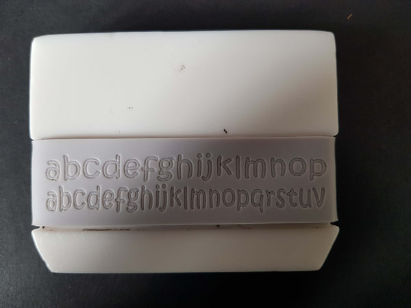
If you look at picture six you’ll see that Straight Up and Playdate fonts have thicker lines and look heavier, so are more suitable for shorter names - those of 3 - 5 characters.
Ideally, if you’re ordering a band with a name as short as this you should be looking to choose one of these fonts. Hanging out would also work but not quite as well as Straight Up and Playdate, and Sloping Off would probably be the least suitable because of its lighter look and finer lines.
Font popularity
So you might wonder which of the fonts is the most popular? Well we’ve noticed that font popularity tends to follow trends. Until recently Hanging Out was the most popular font, probably because it looks slightly more funky than the others! Straight Up is very formal and upright while Sloping Off tends to be more popular with our female buyers, perhaps because it’s a more flowing font.
Towards the middle of 2022 we introduced Playdate, a font we used on the Labelistas bands - Labelistas being the company from which PKS and minaym evolved. Playdate is again proving popular and is fast catching up with Hanging Out as the font of choice! We expect it to become the most popular font as we go through 2023.
So, in summary, the best fonts to go for if you have a long name are the lighter ones, and it’s probably best to stick to the heavier fonts for short names - that is if you want to maximise impact and have your band looking its best.
Icon selection
The last thing to mention is icon selection. All of our icons have a set width and height, and, as previously described, fit into the orange box in our band layout placement. It’s true that a very few of our icons can get a little lost if chosen with a long name - Racing Car is a good example of this. Due to its design it isn’t tall, so if you choose this one with a long name we do have to force the character string length and make the icon slightly larger to give it impact on the band. You might want to consider a taller icon if you are getting your band marked with a long name.
We hope this will help explain a little about the process of band marking and also aid you in choosing your font, lettering and icon. To get the best possible end result all of the factors we’ve mentioned are important and as we want you to be happy customers we strongly recommend you spend a little time thinking about your personalisation choice.
To order your Bottle Bands, please take a look at our Personalised Bottle Bands.